Online Resources
- Design elements, playground and code snippets for Bootstrap HTML/CSS/JS framework
Installing Bootstrap
There are two different ways to include Bootstrap on your website.
- Include links to the CDN CSS and Javascript documents in your file.
- Include the CSS CDN link right above your title in your header.
- <link rel="stylesheet" href="https://stackpath.bootstrapcdn.com/bootstrap/4.5.0/css/bootstrap.min.css" integrity="sha384-9aIt2nRpC12Uk9gS9baDl411NQApFmC26EwAOH8WgZl5MYYxFfc+NcPb1dKGj7Sk" crossorigin="anonymous">
- Include the Javascript CDN link right before the closing <body> tags. jQuery must come first, then Popper.js and then JavaScript.
- <script src="https://code.jquery.com/jquery-3.5.1.slim.min.js" integrity="sha384-DfXdz2htPH0lsSSs5nCTpuj/zy4C+OGpamoFVy38MVBnE+IbbVYUew+OrCXaRkfj" crossorigin="anonymous"></script>
<script src="https://cdn.jsdelivr.net/npm/popper.js@1.16.0/dist/umd/popper.min.js" integrity="sha384-Q6E9RHvbIyZFJoft+2mJbHaEWldlvI9IOYy5n3zV9zzTtmI3UksdQRVvoxMfooAo" crossorigin="anonymous"></script>
<script src="https://stackpath.bootstrapcdn.com/bootstrap/4.5.0/js/bootstrap.min.js" integrity="sha384-OgVRvuATP1z7JjHLkuOU7Xw704+h835Lr+6QL9UvYjZE3Ipu6Tp75j7Bh/kR0JKI" crossorigin="anonymous"></script> - Or you can just copy/paste the entire starter code from Bootstrap's website that includes everything including the boilerplate if you are starting from scratch.
- Download the Bootstrap file and include in your files.
- Example: Just download and reference a local file <link rel="stylesheet" type="text/css" href="css/bootstrap4.5.0.css">
- One disadvantage to this is that no computer can rely on it's cached files to make it faster since so many websites use Bootstrap. This could delay the website rendering a few seconds.
Navbar
< nav>< /nav> is often used to keep the navbar info.
- Need to add class="navbar" to the nav
- When creating list for navbar, use unordered list. Add class="navbar-nav" to ul
- Add class="nav-item" to li. This will take away the bullet point from the list.
- Text inside the li should be a link so it can take you somewhere. Add anchor tag and class="nav-link". This will give it a different color when you hover over it, showing that it is a link.
- Add class="navbar-expand-lg" to nav and it will have the links line up horizontally (instead of vertically) at the lg viewport
- If you add a class="bg-light" or class="bg-dark" to the nav, you will have a different color background for the navbar. You can also use the button color words to change it (ie--danger=red, warning=yellow.
- class="navbar-light" will change the text color from blue to a light gray.
Add Brand/Logo in navbar
- Add class="navbar-brand" to an anchor tag or other element.
Separate links to right side and logo on left side
- In ul add class="ml-auto" (margin left auto)
Other Items You Can Include in Navbar
- Dropdown menu
- Fixed at top of screen, fixed at bottom of screen
- Disabled choices
- Form controls (Such as a search box)
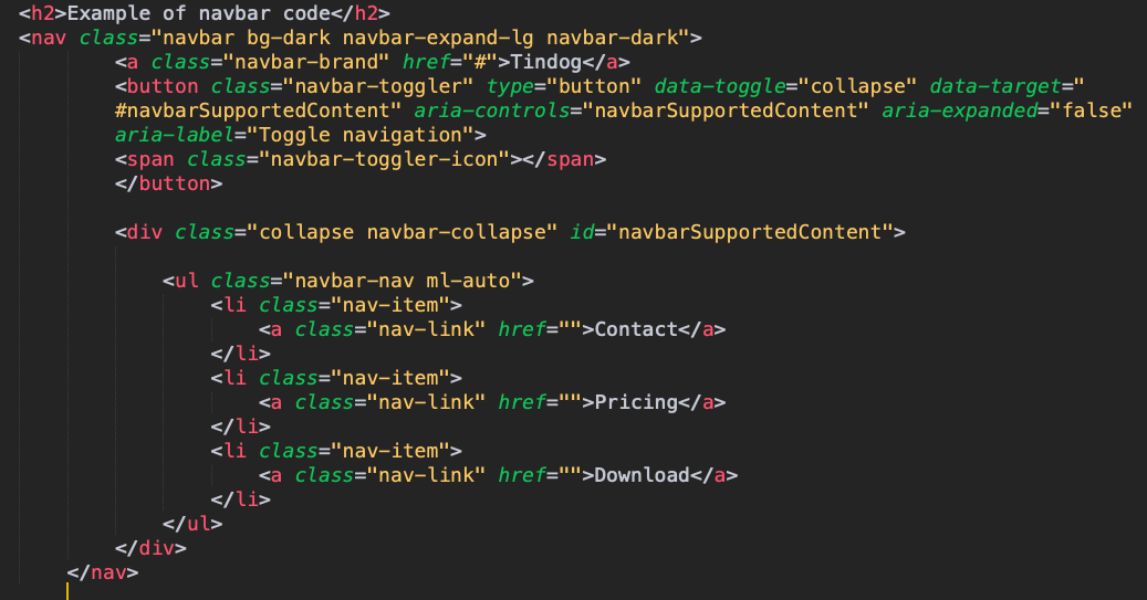
Adding Hamburger/Toggler in Navbar
- Navbar togglers are left-aligned by default, but should they follow a sibling element like a .navbar-brand, they'll automatically be aligned to the far right. Reversing your markup will reverse the placement of the toggler.
- Start by creating a button that targets a specific id.
- <button class="navbar-toggler" type="button" data-toggle="collapse" data-target="#navbarTogglerDemo03" aria-controls="navbarTogglerDemo03" aria-expanded="false" aria-label="Toggle navigation"><span class="navbar-toggler-icon"></span>
- Then you add a div around your unordered list with all of your header choices (home, link, buy, contact, etc.) with the following info. Make sure anchor tag for your logo/brand are above the button so they are each on the correct side.
- <div class="collapse navbar-collapse" id="navbarTogglerDemo03">
Example of navbar code

Bootstrap Grid Layout System
The mobile-first flexbox grid system uses a twelve column system and five default responsive tiers.
- For more info on all of the following techniques, check out Bootstrap Docs.
- You can choose to use a size for each column (make sure they add up to 12)
- You can just leave them as col without a number and let Bootstrap decide
- You can also mix and match setting a number and leaving it without. This will create one column that is a defined size, and the others without a number will be flexible.
- You can use flexbox to change vertical or horizontal alignment of where (less than 12) line up on the screen.
- You can set column breaks. This is helpful with responsive design to look the way you want it to look on each device screen size.
- You can column widths to be specific for different screens.
- When you set them, if you set for md (medium) it will apply to medium and anything larger than that. Anything smaller than that and each column will take up 100% of the screen.
- If you set them to lg (large) it will only apply to large and xl. Anything smaller than that and each column will take up 100% of the screen.
- You can also set multiple sizes for just one column so that it changes for different screen sizes. "col-lg-3 col-md-4 col-sm-6" (This would be four columns if on large size screen, three columns if on tablet sized screen, and two columns if on small screen.
- You can change the order of your columns when they change sizes.
- You can also nest columns inside of other columns.
Basic beginner code if you would like two columns:
- <div class="row">
- <div class="col-lg-6"
</div> (end of col-lg-6)
<div class="col-lg-6"
</div> (end of col-lg-6)
</ div> (end of row)
Containers in Bootstrap
- Containers are the most basic layout element in Bootstrap and are required when using our default grid system.
- Containers are used to contain, pad, and (sometimes) center the content within them.
- It's best to just use .container-fluid (instead of .container or any with sizes) because it sets a max-width of 100% at all breakpoints.
Buttons
Bootstrap includes several predefined button styles, each serving its own semantic purpose, with a few extras thrown in for more control.
- Normal buttons
- Outline only buttons (has a nice hover effect)
- Different button sizes
- Active or Disabled buttons
Carousel
- Copy and paste code from Bootstrap. There are different options for carousels.
- You must have the first id in the first div match the href #samename in the buttons
- If carousel is changing sizes on every switch, set permanent height (check this CSS file for this setting)
Cards
- A card is a flexible and extensible content container. It includes options for headers and footers, a wide variety of content, contextual background colors, and powerful display options.
- They have no margin by default, so use spacing utilities as needed.
- They also have no fixed width to start, so they'll naturally fill the full width of its parent element. It is easily customized with various sizing options.
- Cards support a wide variety of content, including images, text, list groups, links, and more.
Setting up Cards
Chihuahua
FREE
5 Matches per day
10 Messages per day
Unlimited App Usage
Labrador
$49/ mo
Unlimited Matches
Unlimited Messages
Unlimited App Usage
Mastiff
$99/ mo
Priority Listing
Unlimited Matches
Unlimited Messages
Unlimited App Usage
If you don't like how the cards don't line up at the bottom,
- Add a class onto the last paragraph inside the two shorter cards (ie-class="extra-margin-cards") and then specify number of pixels to be added to paragraph. This moves the buttons down so they all lined up.
- Example: .extra-margin-card { margin-bottom: 57px;}

