Online Reference Guide
CSS Syntax
- selector{property:value;}
- If there are any typos or syntax errors in CSS file, the entire entry for that selector will be ignored.
- If you are setting anything to 0 in CSS, you do not need to use the px or other measurement tool. Just type 0;
- MDN CSS Properties Resource: For a resource listing all properties used in CSS

Inline CSS
This is not the preferred way to styling, but can work if testing something out or if you just have to change one or two things.
<body style="background-color: yellow;">
Internal CSS
You can also add a < style> tag at the top of HTML in the head to add a few changes instead of a separate CSS file:
<style>
body {
background-color: blue;
}
</style>
External CSS
Put link in the head just under the title: type Link → Tab : <link rel="stylesheet" type="text/css" href=""> and then fill in the href to css/styles.css (if files are in CSS subfolder, but also in the same main folder as index.html)
You don't want a / in front of css/styles.css unless it is hosted and it is pointing to a root folder.
Divs in HTML (Content Division Element)
They are used to divide your page and add structure and style separately from different elements.
- Default margin in a div is 8px on all sides.
- You can also add borders. Default is 3px wide. This does not encroach on size of div, it adds to it.
- Divs are only useful in HTML if you add some CSS to them.
- When you want first div to go all the way to the sides and top, and have an h1 as first element inside the div, then change body {margin: 0;} and h1 {margin-top:0;}
- When creating sizes for divs, you can give it a specific amount of pixels for width, height. Or you can declare it in a percentage.
Selectors
Tag Selectors
- h1 {}
- Tags are the least specific was to select
- Advanced example: label {text-transform: uppercase;} This will make the < label> elements all UPPERCASE without changing the HTML
Class Selectors
- class="nameHere"
- To select in CSS, the syntax is .nameHere {}
- Class selectors are the second most specific selector for CSS. They are used to group similar elements that are going to have a similar style.
- Elements can have more than one class attached to them.
ID Selectors
- id="nameHere"
- To select in CSS, the syntax is #nameHere {}
- ID's are the most specific selectors you have. You can only use one unique ID per document, and can only assign one ID per element.
- #special:first-letter {color: green; font-size: 100px;} This will make the first letter of the element with id 'special' green and 100px font
Star
- * {margin: 0; padding:0;}
- This will target every single element on a page
- Use for quick tests, but not production code
Descendent Selectors
- li a {color: red;} This will select all anchor tags within the li
Adjacent Selectors
- h4 + ul {border: 4px solid red;} This will select all ul's immediately following (adjacent) to an h4 heading
Attribute Selector
- input [type="checkbox"] {background: blue;} This will select all checkbox fields in a form
- a[href="http://www.google.com/form"] {background: blue;}
- input[type="text"] {background-color: gray;} This will make only inputs with type 'text' have a gray background
- input:checked {margin-left: 50px } This will make all "checked checkboxes have a left margin of 50px
- a:visited {color: gray;} This will make the anchor tag elements gray that have been visited
nth of Type
- ul: nth-of-type (3) {background: purple;} This will select a specific ul, or can set for every other, etc. In this one, only the 3rd ul will have background
- You can change what is inside the () with (even) or (odd) to select every other one
- div:nth-of-type(3) p:nth-of-type(2) {border: 5px solid white} This will give the 2nd < p> inside of the 3rd < div> a 5px white border
- div:nth-of-type(3)em {color: tan; font-size: 20px;} This will make the < em> in the 3rd < div> element tan and 20px font
Pseudo Class:Hover
HTML elements can have different state depending on what you are doing. ie-hover
- a:hover {color: orange;} This will make the anchor tag link change to the color orange when hovered over with the mouse
- h1:hover {color: blue;} This will make the h1 element's color change to blue when hovered over
Combining Selectors
- Multiple Selectors
- h1, h2, h3, h4, h5, h6 {font-family: "Monserrat";}
- Spacing is not specific for this example. This one will apply the font family to all headings.
- Hierarchical Selectors
- #title .container-fluid {padding-top: 3%; text-align: left;}
- It is important there is one space between these two items. This one will select only the .container-fluid inside of the #title and apply the specifics. This is important if you want just the #title to be affected, and not all .container-fluid divs.
- Combined Selectors
- div.container-fluid {color: red;}
- It is important that there is No space between these two items. These have to occur within the same element (ie-the div you call must also have that selector (class or ID within it).
- Direct Child Selector
- .parent > child
- This will target the child div only that is inside of the parent div.
- You can do this at multiple levels.
- .grandparent > .parent > .child
Box Model
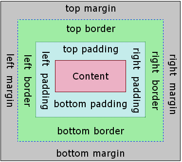
The way that it is laid out on a webpage. Refer to diagram to see specifics.
- Content-width and height
- p {width: 50%}
- This can be done with px or %. % is better for responsive design
- Border
- p {border: 2px solid blue;}
- Remember this order for shortcut to borders
- Padding
- p {padding: 10px;} This adds padding on all 4 sides
- Or you can be specific about only one side p {padding-left: 10px;}
- Margin
- p {margin: 10px;} This adds margin on all 4 sides
- p {margin: 0 auto 0 auto;) and p {margin: 0 auto;) are the exact same. It centers it horizontally for you, and works with responsive designs.
- p {margin: 20px 40px 100px 50px;} The order of this is top=20px, right=40px, bottom=100px, left=50px
CSS Display Property
Can change any element from default display property to a different kind. ie--change < p> to {display: inline;} inside CSS to change it.
- Block Elements
- These take up the entire width of the screen on that line, and therefore don't allow anything else to show up on that line.
- Examples are: paragraphs (< p>), headers (< h1> through < h6>), divisions (< div>), lists and list items (< ol>, < ul>, and < li>) and forms (< form>).
- Inline Elements
- These take up only as much space as they need to in height and width.
- Examples are: spans < span>, images < img>, and anchor tags < a>.
- Cannot change their width. It is determined by the item inside.
- Inline-Block Elements
- This is the best of both worlds from inline and block. You can set an element to be display: inline-block inside CSS. This now allows you to control width as well as leave them on the same line.
- None
- This removes the element from the website completely. {display: none;}
- {Visibility: hidden;} This makes the element invisible, but the space it took up still holds its place. ie--good for a test answer, etc.
CSS Positioning
Static Position
- All elements are static by default.
Relative Position
- If you set {position: relative;} it doesn't actually do anything until you add a coordinate property (top, right, bottom, left) to move it somewhere.
- {position: relative; left: 30px;} Now it has added 30px to the left of the element.
- Two important things to remember about relative positioning.
- When you move an element, it does not affect anything else on the screen. (Could overlap other elements if not used carefully.)
- If you want it to move {top: 50px} it is measuring 50px from where the static location was, and moving the top edge of element down 50px. Think of it as adding a 50px margin to the top of the element.
Absolute Position
- This is positioned relative to the nearest positioned ancestor. However/ if an absolute positioned element as no positioned ancestors, it uses the document body, and moves along with page scrolling. (*A positioned element is one whose position is anything except static.)
- {position: absolute; right:20px} is exactly as adding a 20px margin to the right side of the parent, pulling the child along.
- {position: absolute; top: 100px; left: 100px} moves the element down 100px and to the right 100px.
- Using this takes it out of the flow, and no longer affects other objects positions.
- Think of it as adding a margin to it's parent element.
- Parent element does not have to be the body. The parent could also be the closest parent that has a relative layout.
Fixed Position
- {position: fixed;}
- This is where the element will not move when you scroll through the page.
- It will cover up whatever content is below it as you scroll.
- This is useful for a navbar or sidebar that you want to stay fixed.
Navbar or Any Bar at Top
If adding bar at top and it has margin all around that you don't want:
- In CSS:
- body {
margin: 0;
}
Float
The CSS < float> property specifies how an element should float.
img {float: left;}
The <float> property is used for positioning and formatting content ie-let an image float left to the text in a container.
- In its simplest use, the <float> property can be used to wrap text around images.
- The <float> property can have one of the following values:
- left-the element floats to the left of its container
- right-the element floast to the right of its container
- none-the element does not float (will be displayed just where it occurs in the text). This is default
- inherit-the element inherits the float value of its parent
The CSS <clear> property specifices what elements can float beside the cleared element and on which side.
- .paraText {clear: left} This will remove the float that would have made it float left.
What if you want the paragraph to look like a block ot text next to the image? Without wrapping under the image?
- .no-text-wrap {overflow: hidden;}
- This will not work in IE6.
Centering Text in CSS
- Enclose the div that you want to center with a parent element (commonly known as wrapper or container)
- Set text-align: center to parent element
- Then set the inside div to display: inline-block
- This will work with any element that does not have a width set (ie-inline-block images and block elements.)
- {margin: 0 auto;} This centers an element horizontally that has a width set.
Centering Text without a Parent Element
- text-align: center;
display: flex;
align-items: center; → this centers all elements vertically
justify-content: center; → this centers all elements horizontally
Color in CSS
There are three different ways to list a color in CSS.
- Hexadecimal
- String of 6 hexadecimal numbers (0,1,2,3,4,5,6,7,8,9,A,B,C,D,E,F)
- First 2 digits for Red, second 2 digits for Green, third 2 digits for Blue
- #FF1493
- RGB
- 3 Channels: Red, Green, Blue
- Each ranges from 0-255
- rgb(0, 255, 0)
- RGBA (Alpha/Transparency)
- RGB range 0-255
- A range 0.0-1.0, 0.0 completely transparent and 1.0 no transparency
- rgba(0, 200, 100, 0.5)
Backgrounds in CSS
Images
To set image as background for entire body:
- body {background: url ();} (this could make it repeat/tile)
- body {background-repeat: no repeat;}
- body {background-size: cover;} (this stretches it out)
If CSS file is in main folder and images are in separate image folder
- image {background-image: url('images/cat.png');}
To set image as background in only one div:
- The trick to this is that your CSS is probably in folder called css. If so, you cannot just link to an image in your images folder the same way as you do if it's on the entire body.
- You will need to go up a level by adding ../ to the path.
- div {background-image: url(' ../images/road.jpg');}
- It also needs to be background-image, and not just background.
- If the image is very large (ie-from Unsplash), then you also need to add the following code to have it stretch it's width to the width of the screen.
- div {background-size: cover;}
Gradient Background
- class {background-image: linear-gradient(#ff4c68, #fdfd96);} This is a gradient from top to bottom (which is the default) in red to yellow
- Examples of other options available on W3Schools
Hero Patterns
A collection of repeatable SVG background patterns for you to use on your web projects.
To use:
- Find design you like, click on it
- Change foreground, background, and opacity settings to your preference
- Copy code from top of box into CSS
- Paste code into CSS, body { background-image: }
Also, need to add into CSS, body { margin: 0; } because default is a 10px margin
Also, add body { min-height: 100vh; } so that it covers 100% of the view height on the screen
Border
Border has 3 properties:
- border-width: 5px;
- border-style: solid;
- border-color: purple;
Border shortcut:
- border: 5px solid purple;
Fonts
To see various fonts available, and percentage of Windows/Macs that have them: CSS Font Stack
- Font Family
- p {font-family:"Arial";
- Font Size: can be measured in px, %, em, or rem
- h1 {font-size: 200px;}
- px is a specific size font, won't change with responsive design
- Percentages can also be used. h1 {font-size: 150%;} This one is responsive, but not as good as rem.
- em actually stands for the pronunciation of M. In the old days when they still used typesetting, the M was used as a standard measurement of the width of the capital M. This is no longer true.
- em's are responsive as well, but also inherit font size from their parent (ie-p inside of the body). By using em you sometimes get extremely large font sizes because of the inheritance, and it is hard to find the issue. Rem is still better.
- 1 em = 16px, 2 em = 32px, etc.
- rem is the best one to use. It is responsive, and works exactly like an em except it does not inherit it's parent styles. These are static sizes and show up exactly as programmed in CSS.
- Recommendation: use rem. It is the most predictable, and least error prone of all of them.
- h1 {font-size: 2.0em;}
- em is relative to its parent element. This one would be 2x the size of the parent text.
- Font Weight
- p {font-weight: bold;}
- You can use light or bold here. Also numbers 100(lightest)-800(most bold), multiples of 100
- Line Height (Spacing)
- p {line-height: 2;}
- This is double-spaced
- Text Align
- h1 {text-align: center;}
- Here you can use left, right, or center
- Text Decoration
- p {text-decoration: underline;}
- Other choices are line-through, overline, underline overline
Google Fonts
- Go to Google Fonts.
- Search for font, click on it to go to it's font page.
- Click "+ Select this style" for each one desired.
- Go to Selected Families, and select Embed.
- Copy link and put in head of HTML.
- Copy CSS font-family and put in appropriate spot for webpage.
Rotate Image: CSS Transform Property
- To rotate a photo:
- .class {transform: rotate(20deg);}
- When the degrees specified are positive it rotates to the right, when they are negative it rotates to the left.
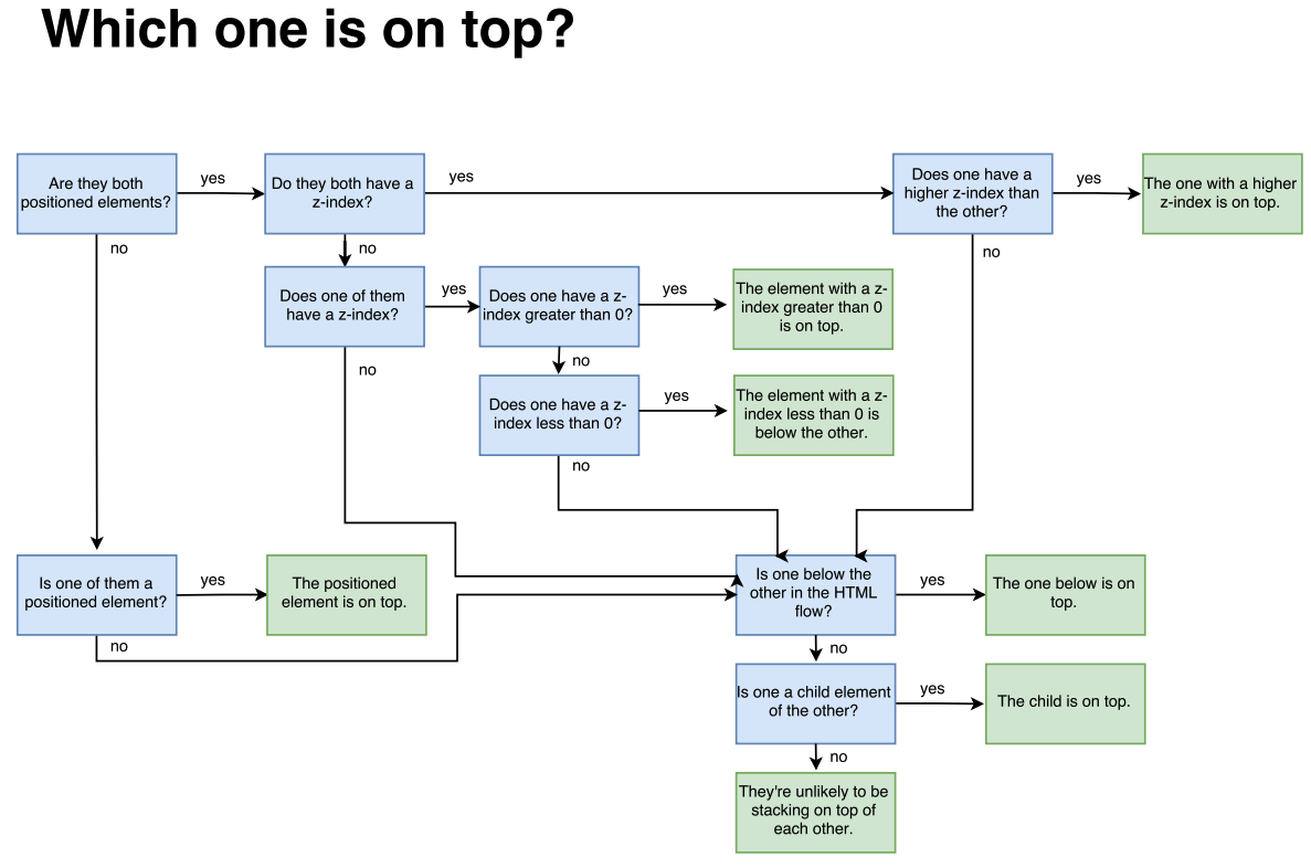
Z-Index
- The z-index property controls the vertical stacking order of elements that overlap.
- Without any z-index value, elements stack in the order that they appear in the DOM.
- Z-index only works on positioned elements (absolute, relative, fixed or sticky).
- img {z-index: -1;}
- You can use numbers to assign a z-index. The higher the number the "closer" it is to you in the stack. (That means the highest number will be on the top of the stack.) Negative numbers are allowed.
- Default z-index = 0
Z-Index Flowchart:
Media Queries
W3Schools: Media Queries - Examples
- @media <type> <feature>
- h1 { font-size: 60px;}, @media (max-width: 900px) { h1 { font-size: 30px;}}
- This means that when the screen being used is 900px or smaller, the font-size will change to 60px. On a larger screen it will be 30px.
- You can also use more than one parameter to really hone in on what you want. Put both, or more, parameters in parenthesis with an "and" in between.
- @media (max-width:900px) and (min-width: 300px) { ... }
- It is important to put the media queries at the bottom of your CSS file so that everything works correctly.
Create a Custom Loading Animation
Debugging CSS Code
Using Google Chrome Developer Tools you can check for errors reported in the code. Using the Elements tab, you can also look at Styles on the right. You can click elements on and off, and see some that are crossed out, to figure out what is happening
Hierarchy is important in CSS/HTML. Inline is most specific, so it ranks the most important. Internal (style at the top) ranks second most important. External is next for importance.
* Best practice is to keep all CSS in external CSS document for future reference.
Flexbox
CSS Tricks: Complete Guide to Flexbox
Flexbox Cheatsheet (printable)
Atomic Design by Brad Frost Video
Search Engine Optimization: 101
Flexbox is an easy way to create an image gallery for responsive design
Example:
You have many images inserted inside your HTML and all are inside of a container.
CSS
- .container {
display: flex;
flex-wrap: wrap;
justify-content: center;
} - img {
width: 450px;
height: 300px;
margin: 10px;
}
CSS Animations & Effects Cheat Sheet
Transition & Transform
Thoughtbot: Transitions & Transforms - Shows what else you can do with this feature
Transitions are a way to control animation speed when changing CSS properties.
Transform lets you rotate, scale, skew, or translate an element.
Example:
This example shows an image that when hovered over will enlarge slightly. To do this you will need to add both the transition element to the img and the transform element to the img:hover.
- img {
transition: all 1s;
} - img:hover {
transform: scale(1.1);
}




Make Square Photo into a Circle
- Create a class for the img in html
- Target that class in CSS
- Set border radius to 100%
- .class {border-radius: 100%;}
